Cars+ is a digital vehicle purchasing platform that offers pickup and delivery options to customers. Cars+ targets customers that have limited access to physical car dealerships and want to have a easier reservation process.
The Problem
Users run into frustration with traditional car purchasing processes.
The Solution
Design an app for Cars+ that allows users to easily reserve, pickup their chosen vehicle.
User Research
I conducted interviews and created empathy maps to understand the users I’m designing for and their needs. A primary user group identified through research was working adults who were actively looking for new vehicles.
This user group confirmed initial assumptions about Cars+ customers, but research also revealed that accessibility was not the only factor limiting users from going to physical vehicle dealerships. Other user problems included obligations, interests, or challenges that make it difficult to get physical vehicle dealerships.
The User
Name: Amari
Age: 57
Occupation: Photographer
Amari is a graduate student who needs access to an easy vehicle purchasing experience because they need transportation to start his Masters degree program.
Paper Wireframes
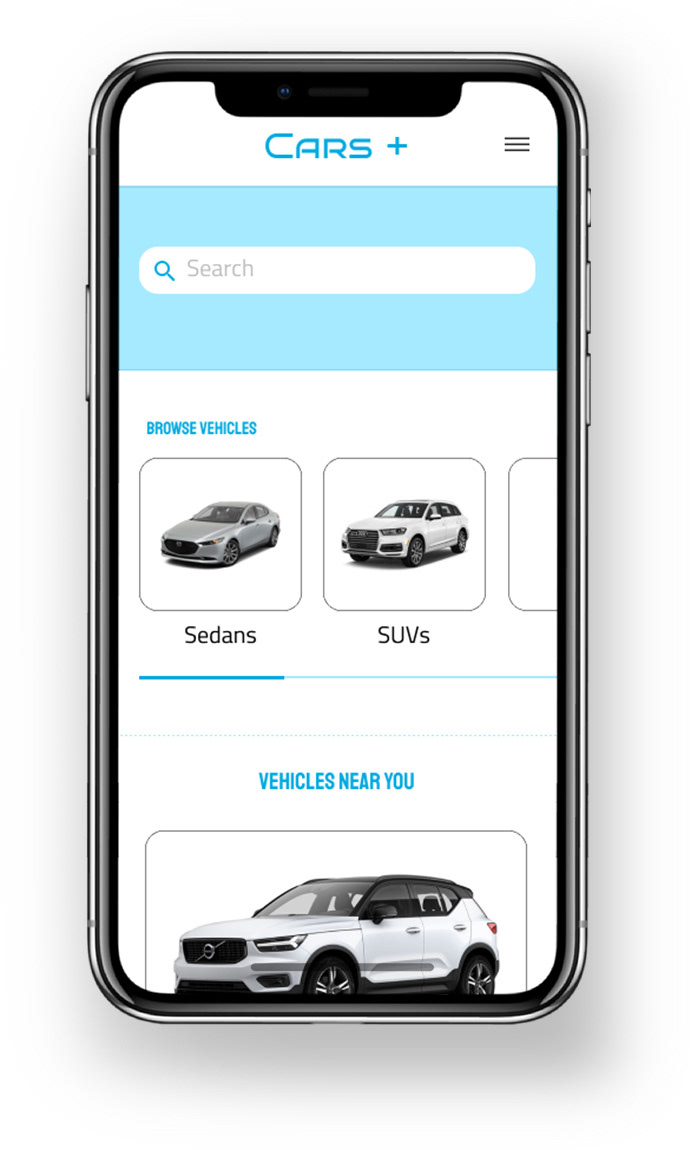
Taking the time to draft iterations of each screen of the app on paper ensured that the elements that made it to digital wireframes would be well-suited to address user pain points. For the home screen, I prioritized a quick view of vehicle choices to help users save time.
Wireflow
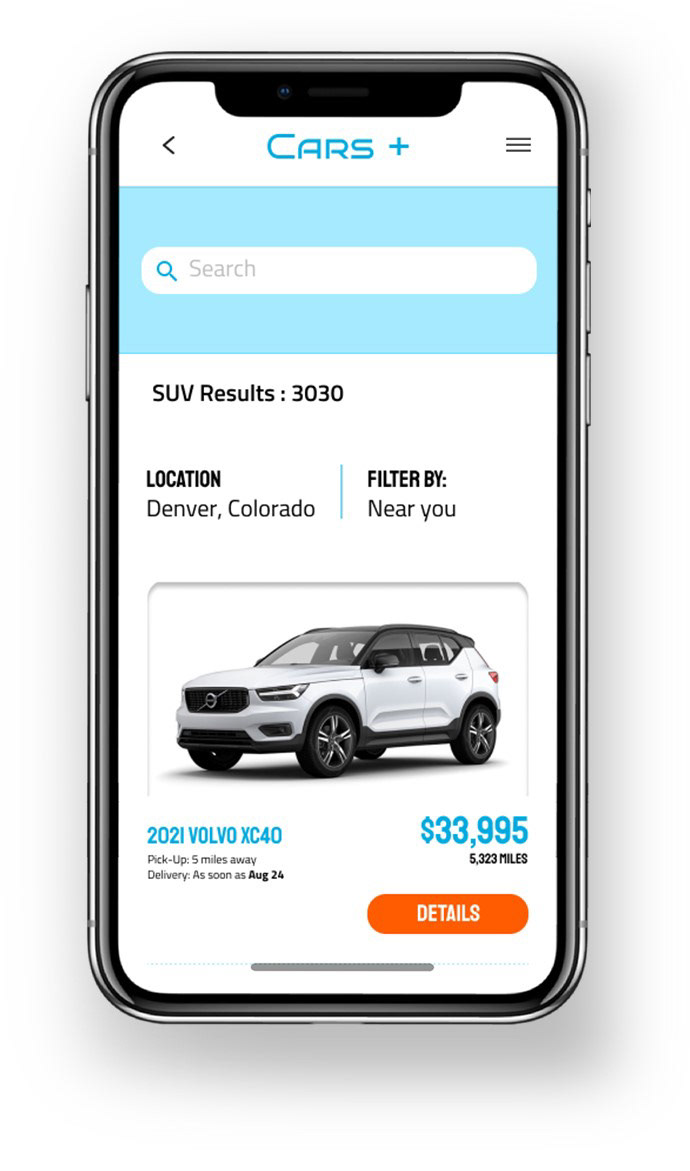
Using the completed set of digital wireframes, I created a low-fidelity prototype. The primary user flow I connected was reserving a vehicle, so the prototype could be used in a usability study.
Solution
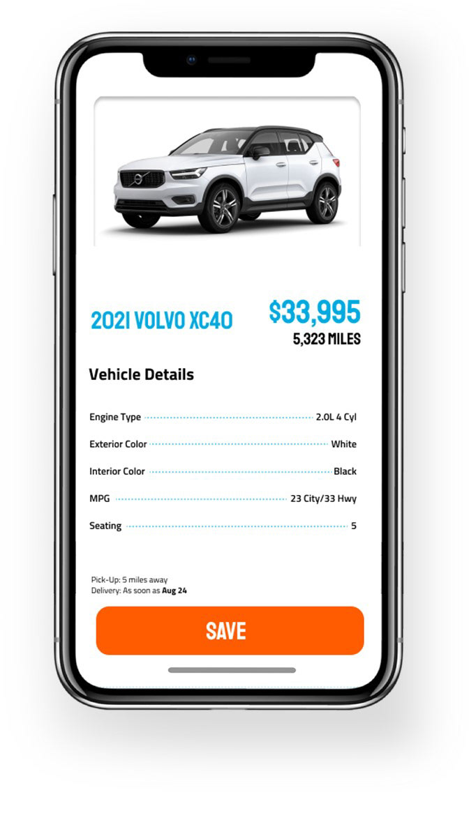
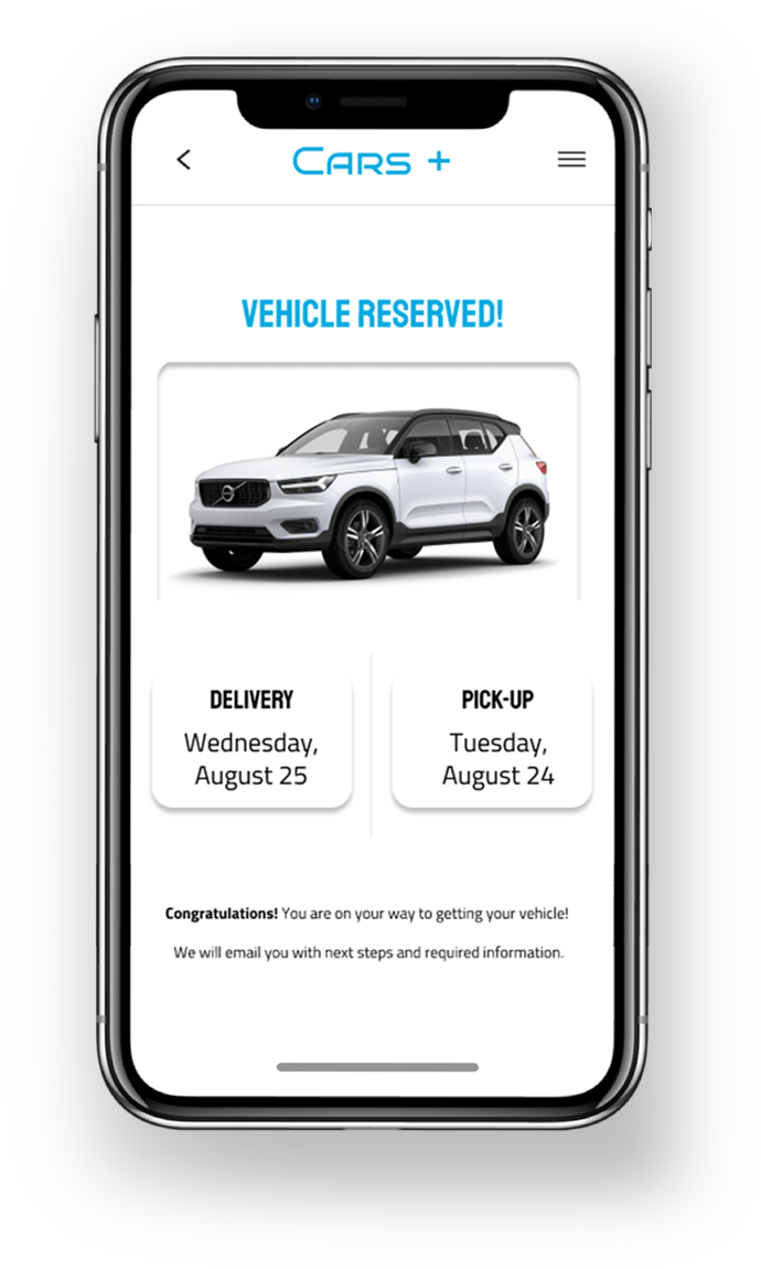
Takeaways
While designing the Cars+ app, I learned that the first ideas for the app are only the beginning of the process and they complete process of creating an app start centrally at the user. Usability studies and peer feedback influenced each iteration of the app’s designs.
