Chef Connect is a culinary networking platform that offers a more efficient networking experience. Chef Connect targets culinary beginners, seasoned professionals and anyone in between.
The Problem
Available culinary networking websites have cluttered designs, inefficient access and processes for users who specifically want to network with others chefs.
The Solution
Design a Chef Connect website to be user friendly by providing clear navigation and processes for users to network with other chefs.
User Research
I conducted interviews and created empathy maps to understand the users I’m designing for and their needs. A primary user group identified through research were studying culinary students who were actively looking for culinary mentors.
This user group confirmed initial assumptions about Chef Connect customers, but research also revealed that access was not the largest problem users faced when going to other networking sites. Other user problems included confusing navigation or challenges that make it difficult to get access to culinary mentors.
The User

Name: Adrian
Age: 20
Occupation: Concierge
Adrian is a studying culinary student who needs a better way to network with culinary professionals because they want to advance their culinary skills.
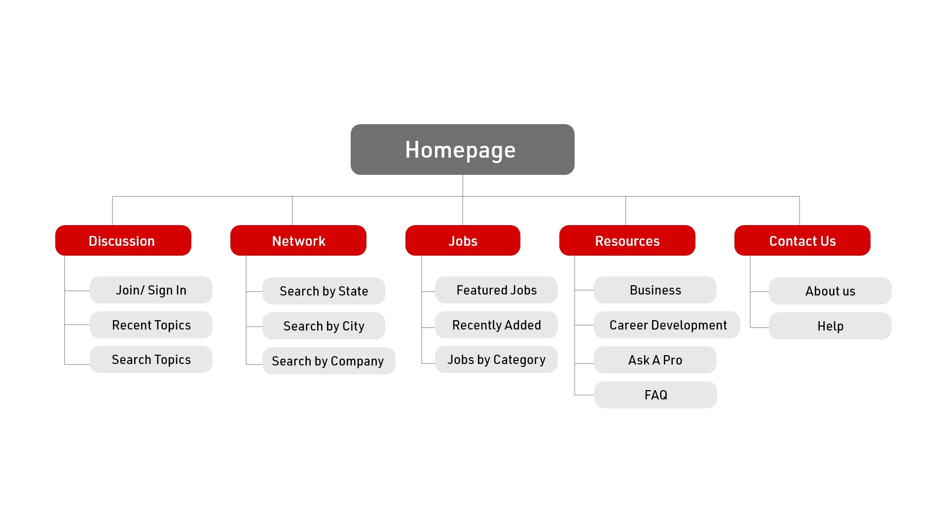
Information Architecture
Difficulty with website navigation was a primary pain point for users, so I used that knowledge to create a sitemap.
My goal here was to make strategic information architecture decisions that would improve overall website navigation and create a concise structure.
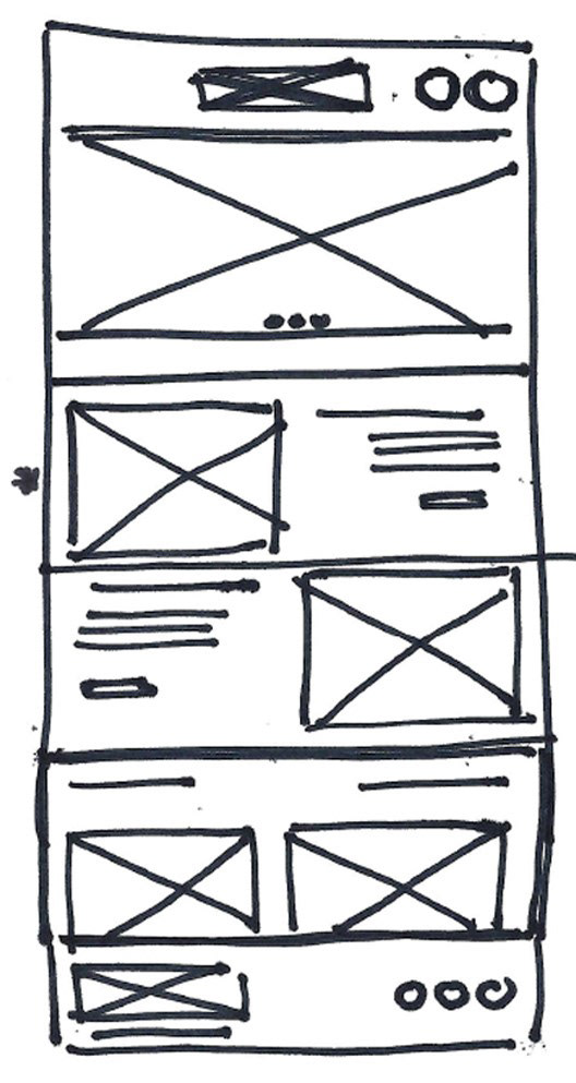
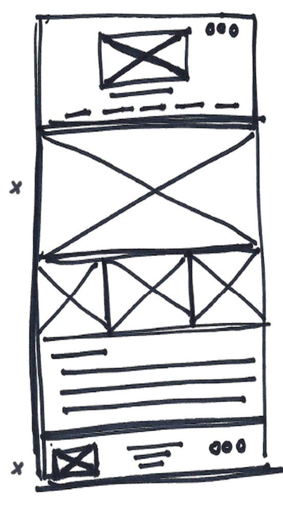
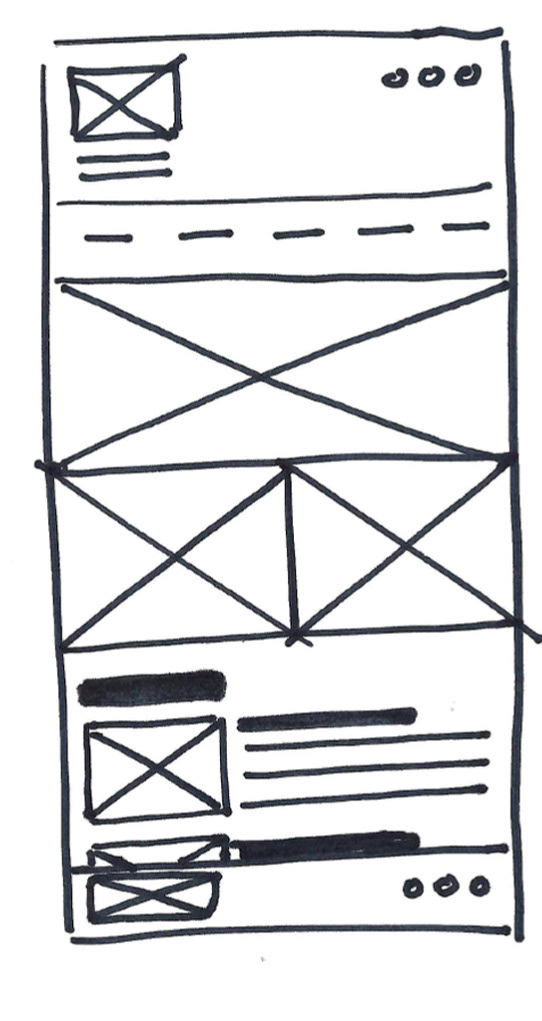
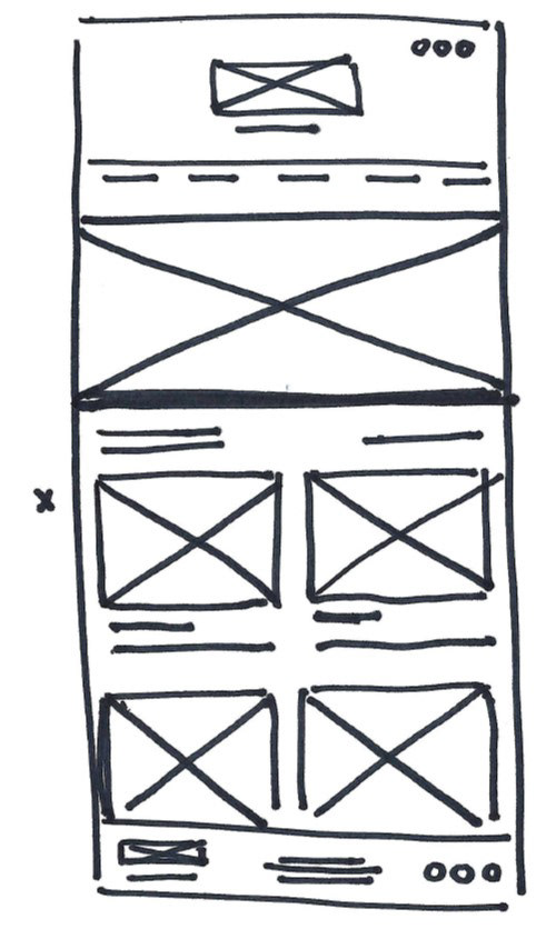
Ideation
I sketched out paper wireframes for each screen in my app, keeping the user pain points about navigation, browsing, and checkout flow in mind. The home screen paper wireframe variations focus on optimizing the hierarchy of important information.

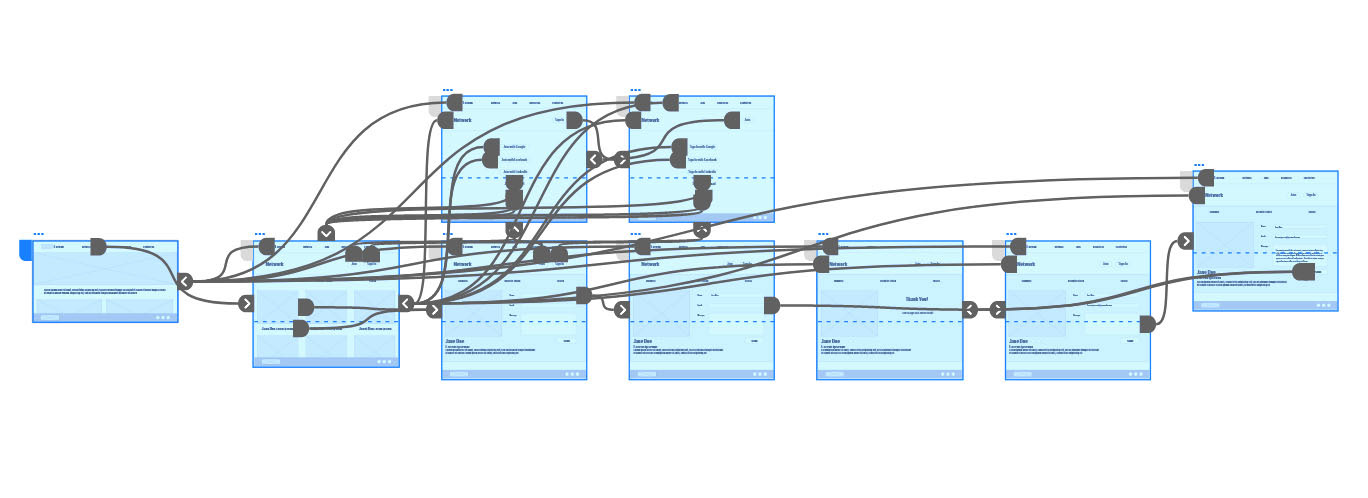
Wireflow
Moving from paper to digital wireframes made it easy to understand how the redesign could help address user pain points and improve the user experience.
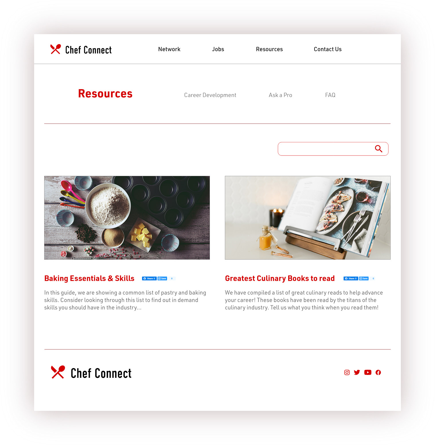
Prioritizing useful button locations and visual element placement on the home page was a key part of my strategy.I connected all of the screens involved in the primary user flow of networking with one culinary mentor.
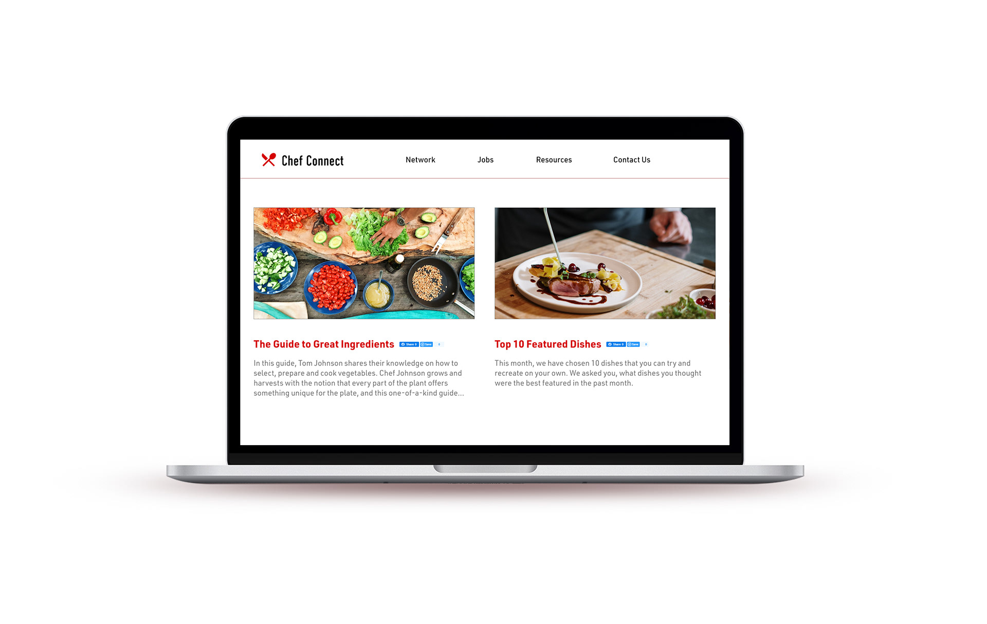
Solution
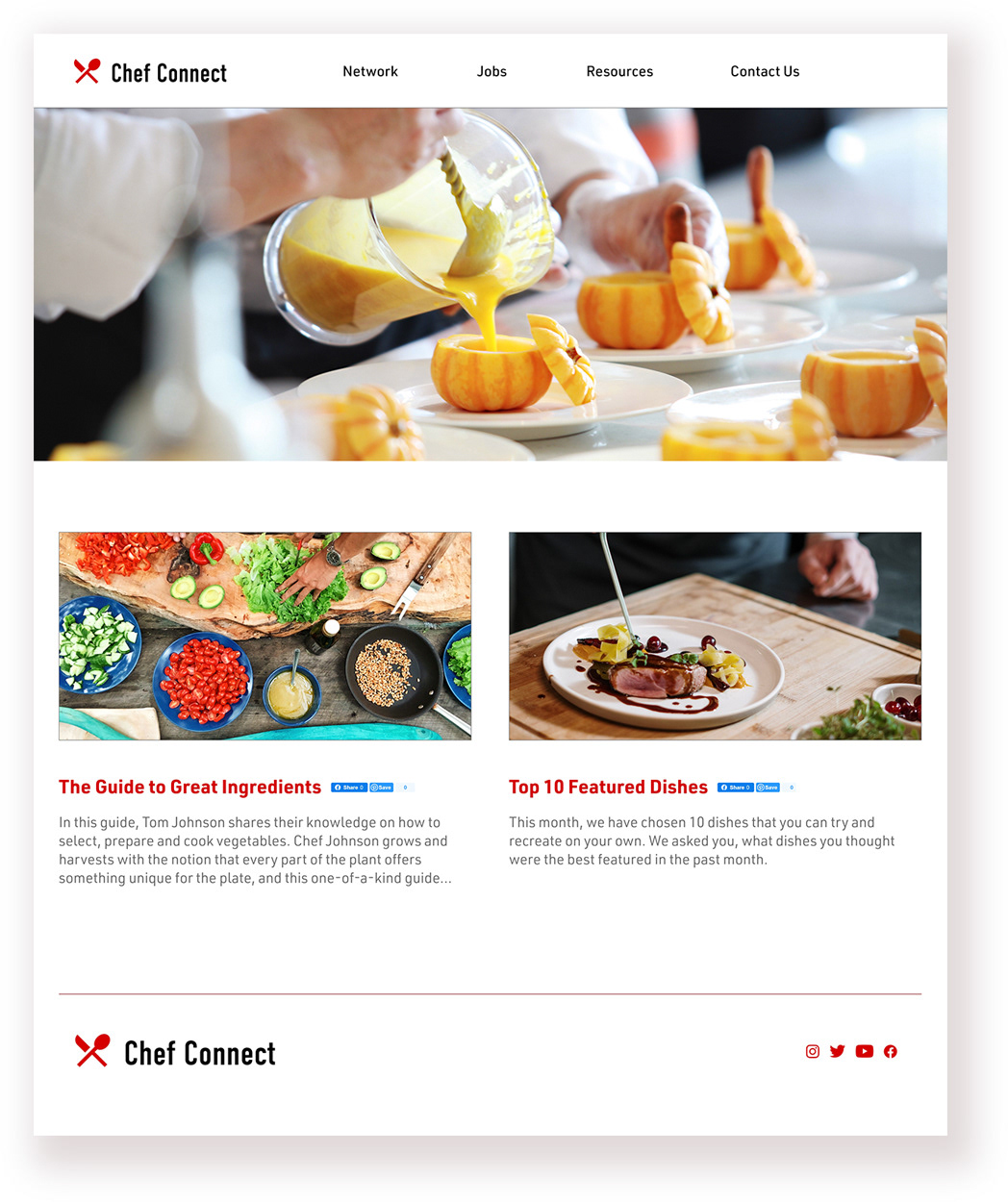
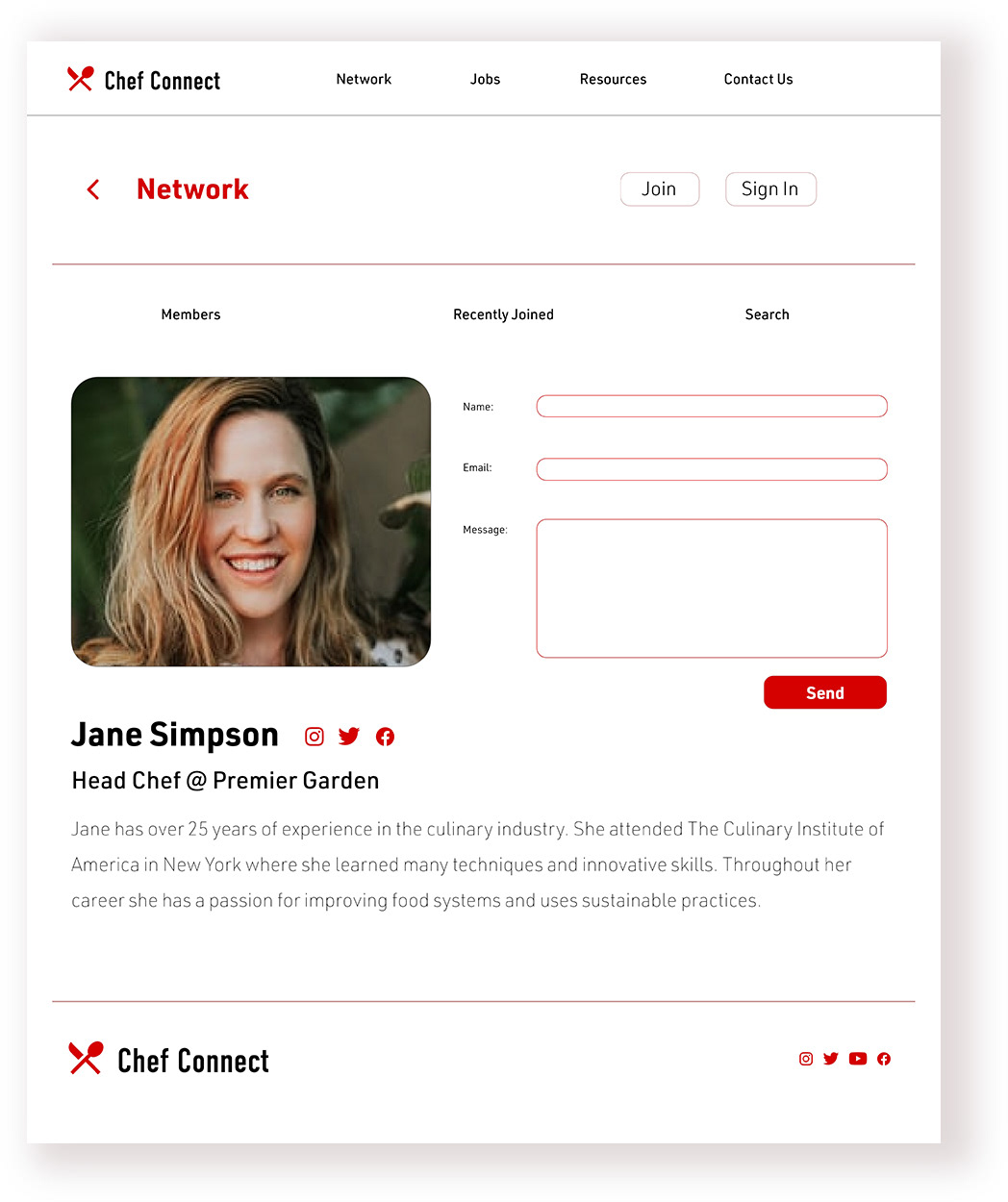
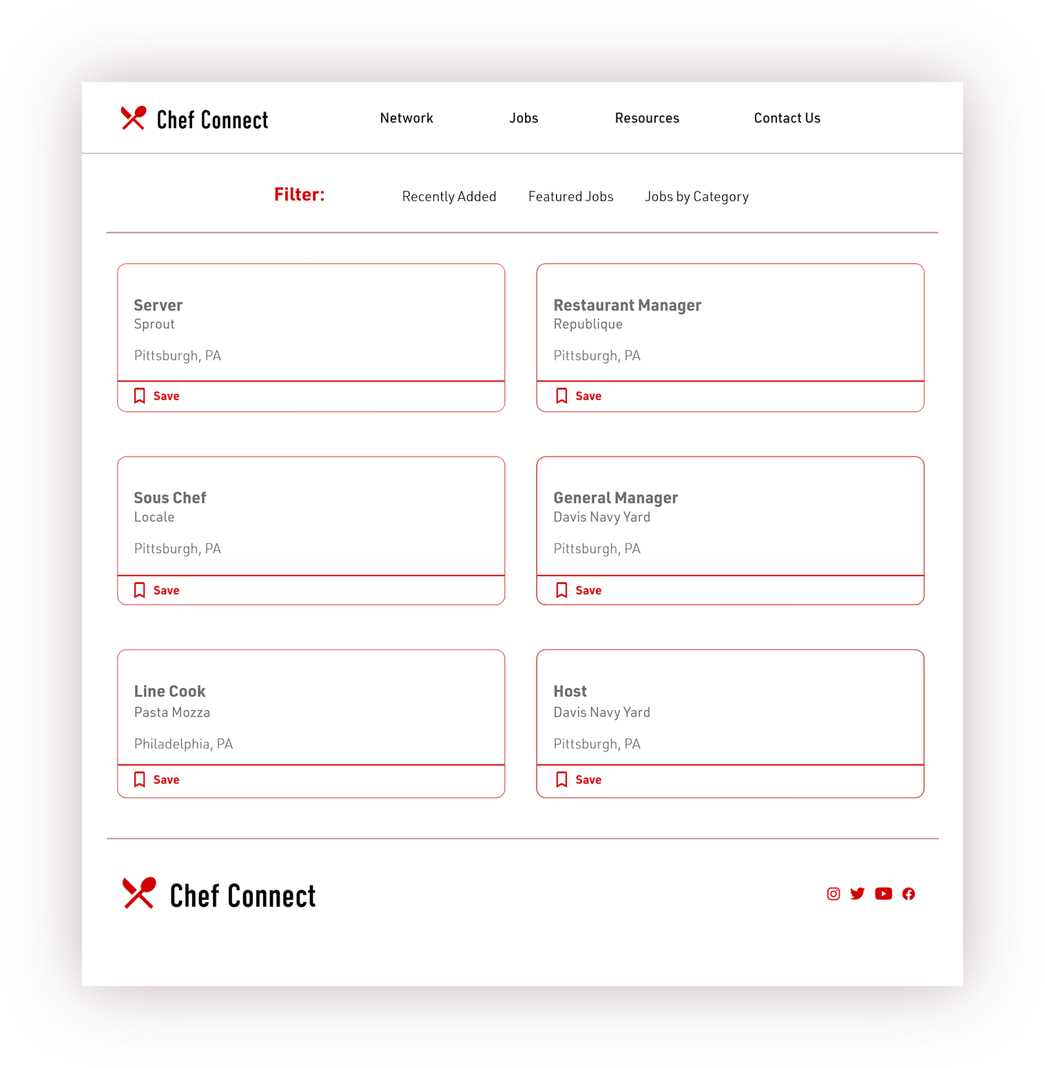
This is a caption.
Takeaways
I learned how different of a structure a website can have over an app and how translating variations have a huge impact on the user experience. The most important takeaway for me is to always focus on the needs of the user when coming up with design ideas and solutions.